

If you’ve ever looked at a stock chart and felt completely confused, you’re not alone.
For beginners, stock graphs can look like a bunch of random lines moving up and down without any clear meaning. But once you understand the basics, reading stock graphs becomes much easier. In fact, learning how to read stock charts is one of the most valuable skills an investor can develop.
Whether you’re investing in stocks, ETFs, or even cryptocurrencies, charts can help you understand market trends, identify potential opportunities, and make more informed decisions.
In this guide, you’ll learn exactly how to read stock graphs, what the different chart elements mean, and how beginners can use charts without getting overwhelmed.
Why Learning to Read Stock Graphs Matters?
A stock graph tells the story of a stock’s price movement over time.
Instead of reading hundreds of pages of financial reports, a chart gives you a quick visual snapshot of:
- Whether a stock is rising or falling
- How volatile the stock is
- Recent price trends
- Market sentiment
- Potential buying or selling opportunities
While charts shouldn’t be the only factor in your investment decisions, they can provide valuable context.
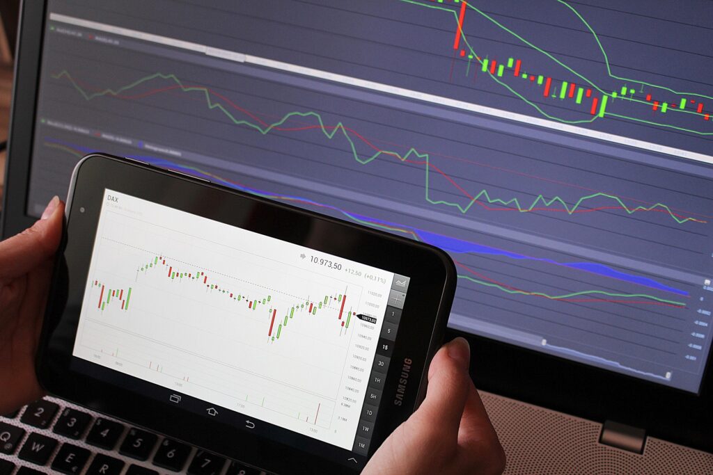
What Is a Stock Graph?
A stock graph (also called a stock chart) is a visual representation of a stock’s price over a specific period.
The graph shows how buyers and sellers have valued a stock over time.
Every stock chart contains two basic components:
The Horizontal Axis (X-Axis)
The horizontal axis represents time.
Depending on the chart settings, it may show:
- Minutes
- Hours
- Days
- Weeks
- Months
- Years
For example:
- A day trader might use a 5-minute chart.
- A long-term investor might use a 5-year chart.
The Vertical Axis (Y-Axis)
The vertical axis represents price.
As the stock price increases, the chart moves upward.
As the stock price decreases, the chart moves downward.
ALSO READ: How to Start Investing at 18 With Only $100
Understanding the Most Common Types of Stock Charts
There are several chart styles available, but beginners should focus on three main types.
1. Line Charts
A line chart connects closing prices over a specific period.
This is the simplest chart type.
Benefits of Line Charts
- Easy to understand
- Great for beginners
- Shows overall trend clearly
Many investing apps use line charts as the default view.
2. Bar Charts
Bar charts provide more information than line charts.
Each bar shows:
- Opening price
- Closing price
- Highest price
- Lowest price
These charts offer deeper insights into market activity.
3. Candlestick Charts
Candlestick charts are the most popular chart type among traders.
Each candle represents a specific time period.
The candle displays:
- Opening price
- Closing price
- High price
- Low price
Although they may seem complicated at first, candlestick charts become easier to understand with practice.
How to Read a Candlestick Chart?
Since candlestick charts are widely used, let’s break them down.
i. Green Candles
A green candle means the stock closed higher than it opened.
This indicates buying pressure.
ii. Red Candles
A red candle means the stock closed lower than it opened.
This indicates selling pressure.
iii. The Candle Body
The thick part of the candle is called the body.
It shows the difference between the opening and closing prices.
iv. The Wicks
The thin lines above and below the body are called wicks.
They show the highest and lowest prices reached during that period.

Understanding Stock Trends
One of the most important skills in reading stock graphs is identifying trends.
Uptrend
An uptrend occurs when prices consistently move higher.
Characteristics include:
- Higher highs
- Higher lows
This often signals strong demand.
Downtrend
A downtrend occurs when prices continue moving lower.
Characteristics include:
- Lower highs
- Lower lows
This usually indicates weakness in the stock.
Sideways Trend
Sometimes stocks move within a range.
Prices neither rise significantly nor fall significantly.
This is called consolidation.
Support and Resistance Levels
Support and resistance are key concepts in technical analysis.
What Is Support?
Support is a price level where buyers tend to enter the market.
When a stock reaches support, it may stop falling and begin rising.
Think of support as a floor beneath the stock price.
What Is Resistance?
Resistance is a price level where sellers often appear.
When a stock reaches resistance, it may struggle to move higher.
Think of resistance as a ceiling above the stock price.
What Does Trading Volume Mean?
Volume measures how many shares are traded during a specific period.
Volume usually appears as bars below the stock chart.
Why Volume Matters
Volume can confirm the strength of a move.
For example:
- Rising prices with high volume often indicate strong buying interest.
- Falling prices with high volume may indicate strong selling pressure.
Many experienced investors watch volume closely.
Understanding Moving Averages
Moving averages are popular indicators that help smooth out price fluctuations.
They make trends easier to identify.
50-Day Moving Average
The 50-day moving average reflects the stock’s average price over the last 50 trading days.
Many investors use it to identify medium-term trends.
200-Day Moving Average
The 200-day moving average reflects long-term performance.
When a stock trades above its 200-day moving average, it is often considered strong.
How to Spot Bullish Signals on a Stock Chart?
While no signal is perfect, some chart patterns are generally considered positive.
Higher Highs and Higher Lows
This suggests buyers remain in control.
Breakout Above Resistance
When a stock moves above a resistance level, it may continue higher.
Strong Volume
High volume can support the validity of a price move.
How to Spot Bearish Signals?
Certain chart behaviors may indicate weakness.
Lower Highs and Lower Lows
This often suggests sellers are controlling the market.
Breakdown Below Support
When support fails, prices may continue downward.
Heavy Selling Volume
Strong selling activity can indicate negative sentiment.
Common Stock Chart Patterns Beginners Should Know
Double Bottom
Looks like the letter “W.”
This pattern often suggests a possible trend reversal upward.
Double Top
Looks like the letter “M.”
This pattern can indicate a potential downward reversal.
Ascending Triangle
This pattern forms when prices create higher lows while resistance remains relatively flat.
Many traders view this as a bullish pattern.
Mistakes Beginners Make When Reading Stock Graphs
i. Focusing on One Day of Price Action
A single day’s movement rarely tells the full story.
Always zoom out and view larger timeframes.
ii. Ignoring the Company’s Fundamentals
Charts are useful, but they don’t replace business analysis.
Strong companies generally perform better over the long term.
iii. Chasing Every Pattern
Not every chart pattern leads to a profitable trade.
Use charts as part of a broader investing strategy.
iv. Making Emotional Decisions
Fear and greed often cause investors to misinterpret charts.
Stay objective and follow your plan.
Best Free Tools for Viewing Stock Charts
Several platforms provide excellent charting tools.
Popular options include:
These platforms allow investors to practice reading charts without paying for expensive software.
A Simple Process for Reading Any Stock Graph
Whenever you open a stock chart, ask yourself these questions:
- Is the stock trending up, down, or sideways?
- Where are the support and resistance levels?
- Is trading volume increasing or decreasing?
- Is the stock above or below major moving averages?
- What has the stock done over the last year?
Answering these questions can provide a much clearer picture of the stock’s overall health.
ALSO READ: Best Growth ETFs for Beginners With Little Money
Final Thoughts
So, how do you read stock graphs?
It starts with understanding the basics: price, time, trends, volume, support, resistance, and moving averages. Once you learn these building blocks, stock charts become far less intimidating.
The good news is that you don’t need to become a professional trader overnight. Start by analyzing a few charts every day. Over time, you’ll begin noticing patterns, trends, and signals that once seemed impossible to understand.
Like any skill, reading stock graphs improves with practice. The more charts you study, the more confident you’ll become in interpreting what the market is trying to tell you.